Table of Contents
Objective:
To understand Gaussian process regression, and to be able to generate nonparametric regressions with confidence intervals. Also to understand the interplay between a kernel (or covariance) function, and the resulting confidence intervals of the regression.
Deliverable:
You will turn in an iPython notebook that performs Gaussian process regression on a simple dataset. You will explore multiple kernels and vary their parameter settings.
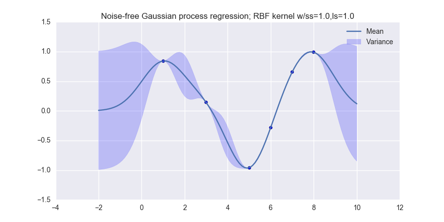
When you are done, you should produce visualizations like the following (for noiseless observations):
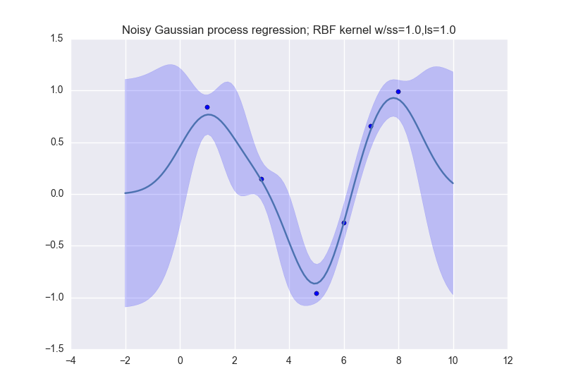
and like this (for noisy observations):
Grading standards:
Your notebook will be graded on the following:
- 20% Correct implementation of three kernels
- 30% Correct implementation of noiseless GPR
- 30% Correct implementation of noisy GPR
- 20% Six tidy and legible plots, with appropriate ranges
Description:
The data that we will use for this lab is simple:
data_xvals = numpy.atleast_2d( [ 1.0, 3.0, 5.0, 6.0, 7.0, 8.0 ] )
data_yvals = numpy.sin( data_xvals )
You must perform Gaussian process regression on this dataset, and produce visualizations for both noiseless and noisy observations. Your notebook should produce one visualization for each of the following kernel types:
- The linear kernel (MLAPP 14.2.4)
- The Gaussian (or RBF) kernel (MLAPP 14.2.1; use the isotropic kernel in Eqn. 14.3)
- The polynomial kernel (MLAPP 14.2.3, in the text right after Eqn. 14.13)
Therefore, your notebook should produce six different visualizations: two for each kernel type.
For the noisy observation case, use \sigma_n^2=0.1.
For the polynomial kernel use a degree of 3.
For the Gaussian / RBF kernel, set all parameters to 1.0
The mean function for this lab should always return 0.
You should also answer the following questions:
- What happens when the bandwidth parameter \sigma_n of the Gaussian kernel gets small? Gets large?
- What happens when the degree M of the polynomial kernel gets small? Gets large?
Your visualizations should be done on the range [-2 10] of the x-axis.
For the errorbars, you can just plot the mean +/- the variance. This isn't really a statistically meaningful quantity, but it makes the plots look nice. :)
Hint: a Gaussian process only allows you to make a prediction for a single query point. So how do you generate the smoothly varying lines in the example images?
Hints:
The following functions may be useful to you:
numpy.arange()

plt.gca().fill_between
plt.scatter

numpy.linalg.pinv

numpy.eye