This is an old revision of the document!
Table of Contents
Objective:
Get started with anaconda, python, ipython notebooks, and pandas. Begin producing simple visualizations of data and images.
Deliverable:
For this lab, you will submit an ipython notebook. This notebook will have two parts:
Part 1: Your notebook should generate a random image. We will run this notebook 5 times; it should generate 5 different, moderately complex images. Each image should be 512 x 288. Have fun with it!
The resulting image could, for example, look like this:

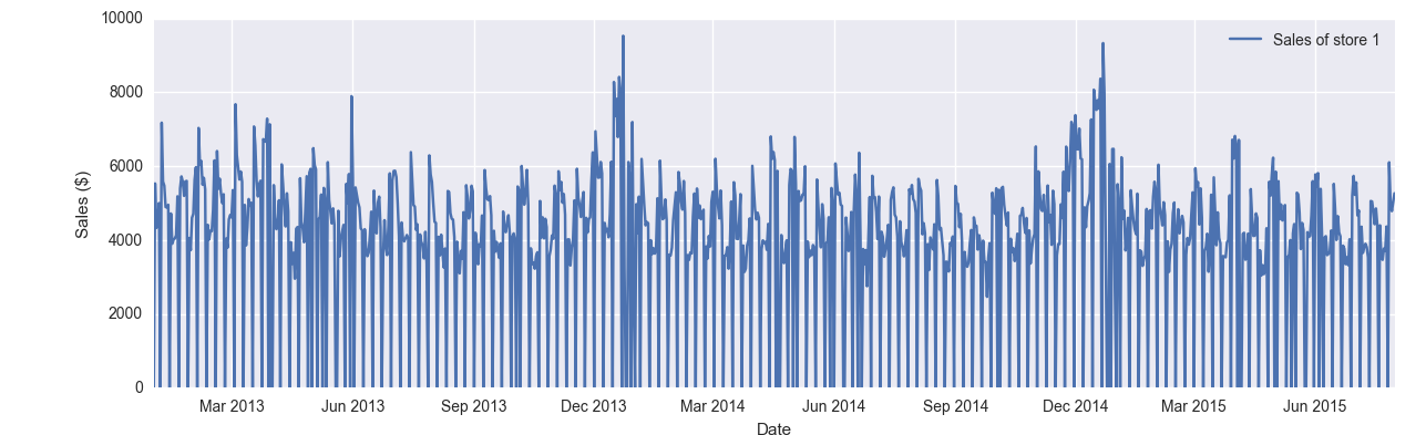
Part 2: Your notebook should use the pandas library to read in the Rossman store sales data (a CSV dataset) and plot the sales of store #1. Your plot should look something like this:
Done correctly, this should only take a few lines of code.
Grading standards:
Your notebook will be graded on the following:
- 20% Successfully turned in a notebook with working code
- 20% Random image with 50 random elements
- 20% Correctly used pandas to load store sales data
- 30% Some sort of plot of sales data (only for store #1!)
- 10% Tidy and legible figures, including labeled axes where appropriate
Description:
Throughout this class, we will be using a combination of ipython notebooks and the anaconda python distribution. For this lab, you must install anaconda, and write a simple python program (using ipython notebooks). As described above, the notebook should do two things: 1) generate simple random images, and 2) plot some data using pandas.
For part 1, you can generate any sort of random image that you want – consider random lines, random curves, random text, etc. Each time the program is run, it should generate a different random image. Your image should have at least 50 random elements (they can all be the same type, such as random lines, and can be created in a loop). We won't count the number of elements; this is just to encourage you to create random images with moderate complexity.
In preparation for future labs, we strongly encourage you to use the cairo package as part of your image generator.
For part 2, the data you should use is downloadable here:
Installing anaconda:
http://docs.continuum.io/anaconda/install
To generate images, check out PIL and cairo:
conda install cairo
To generate random numbers, check out the numpy.random module.
To create a new notebook, run:
jupyter-notebook
This should start an ipython kernel in the background, set up a webserver, and point your browser to the webserver. In the upper-right corner, you will see a “new” menu; under that menu you should see “Notebook” and “Python 2”. This will create a new notebook.
Note: When you turn in your notebook, you should turn in the .ipynb file. Do not take a screen shot, or turn in an HTML page.
Here's some starter code to help you generate an image. The nbimage function will display the image inline in the notebook:
import cairo
import numpy

# A simple function to display an image in an ipython notebook
def nbimage( data ):
    from IPython.display import display, Image
    from PIL.Image import fromarray
    from StringIO import StringIO

    s = StringIO()
    fromarray( data ).save( s, 'png' )
    display( Image( s.getvalue() ) )

WIDTH = 512
HEIGHT = 288

# this is a numpy buffer to hold the image data
data = numpy.zeros( (HEIGHT,WIDTH,4), dtype=numpy.uint8 )

# this creates a cairo context based on the numpy buffer
ims = cairo.ImageSurface.create_for_data( data, cairo.FORMAT_ARGB32, WIDTH, HEIGHT )
cr = cairo.Context( ims )

# draw a blue line
cr.set_source_rgba( 1.0, 0.0, 0.0, 1.0 )
cr.set_line_width( 2.0 )
cr.move_to( 0.0, 0.0 )
cr.line_to( 100.0, 100.0 )
cr.stroke()

# display the image
nbimage( data )
Using Pandas:
For the second part of this lab, you will need to understand the pandas python package, just a little bit. For this lab, you only need to know how to select some data from a CSV file.
You should read through this tutorial and play with it.
For this lab, you need select the data for store #1 and plot it.
An important part of generating visualizations is conveying information cleanly and accurately. You should therefore label all axes, and in particular, the x-axis should be labeled using dates (See the example image). This involves a bit of python trickery, but check out some helpful functions in the hints below.
Hints:
The following python functions might be helpful:
import matplotlib.pyplot as plt
plt.plot_date

pandas.to_datetime

plt.legend
plt.xlabel
plt.ylabel

plt.tight_layout
